Patch app

client

Outer Labs

Role

UX Design

UI Design

Web/Mobile
Dev

Tools

Figma

Micro

Timeline

2020

Summary

Originally developed to support higher education with room and equipment checkout, Patch evolved during the COVID-19 pandemic to accommodate the growing need for remote learning solutions.

original designs

Before I joined the team, Patch was built using out-of-the-box Material Design components. While this allowed for rapid development, user feedback indicated that the app felt stagnant and was actually difficult to use. We needed to revitalize the interface and significantly improve the user experience.

Discovery

Before jumping into design work, I took time to thoroughly understand the app. Creating user flows, breaking down major features, and asking lots of questions helped me approach Patch with an open and honest mindset.

These efforts not only helped me gain clarity, but also enabled executives to clearly see the problems and identify key areas for improvement during presentations.

Discovery part 2

I genuinely enjoy this part of the process—gathering 'evidence' and creating project artifacts that document the who, what, and why of an application. I love learning about people, uncovering their motivations, and identifying their pain points. Being able to translate those insights into meaningful solutions is both exciting and deeply rewarding for me.
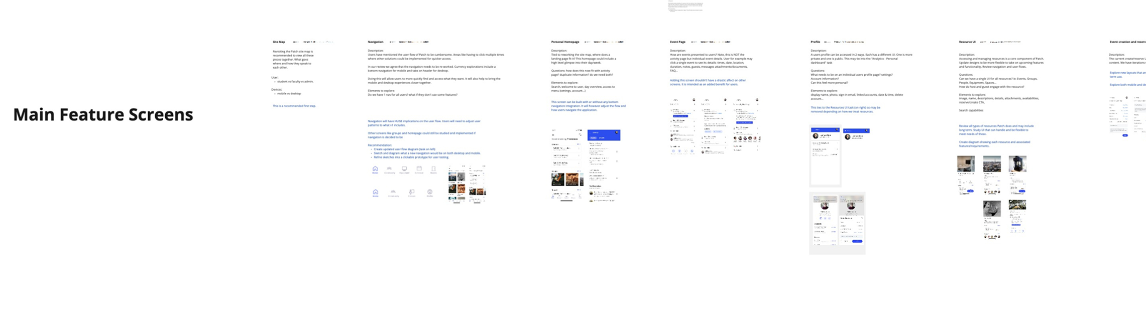
designs

I realize I’m skipping a few steps here, but quality research truly lays the foundation for effective design.

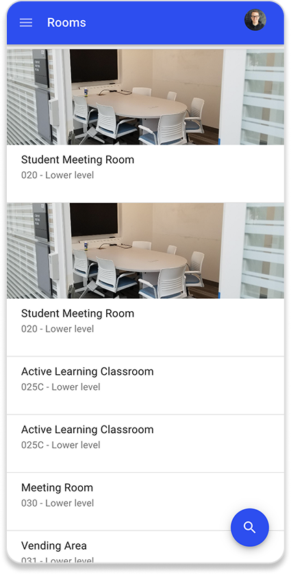
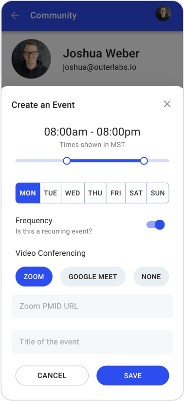
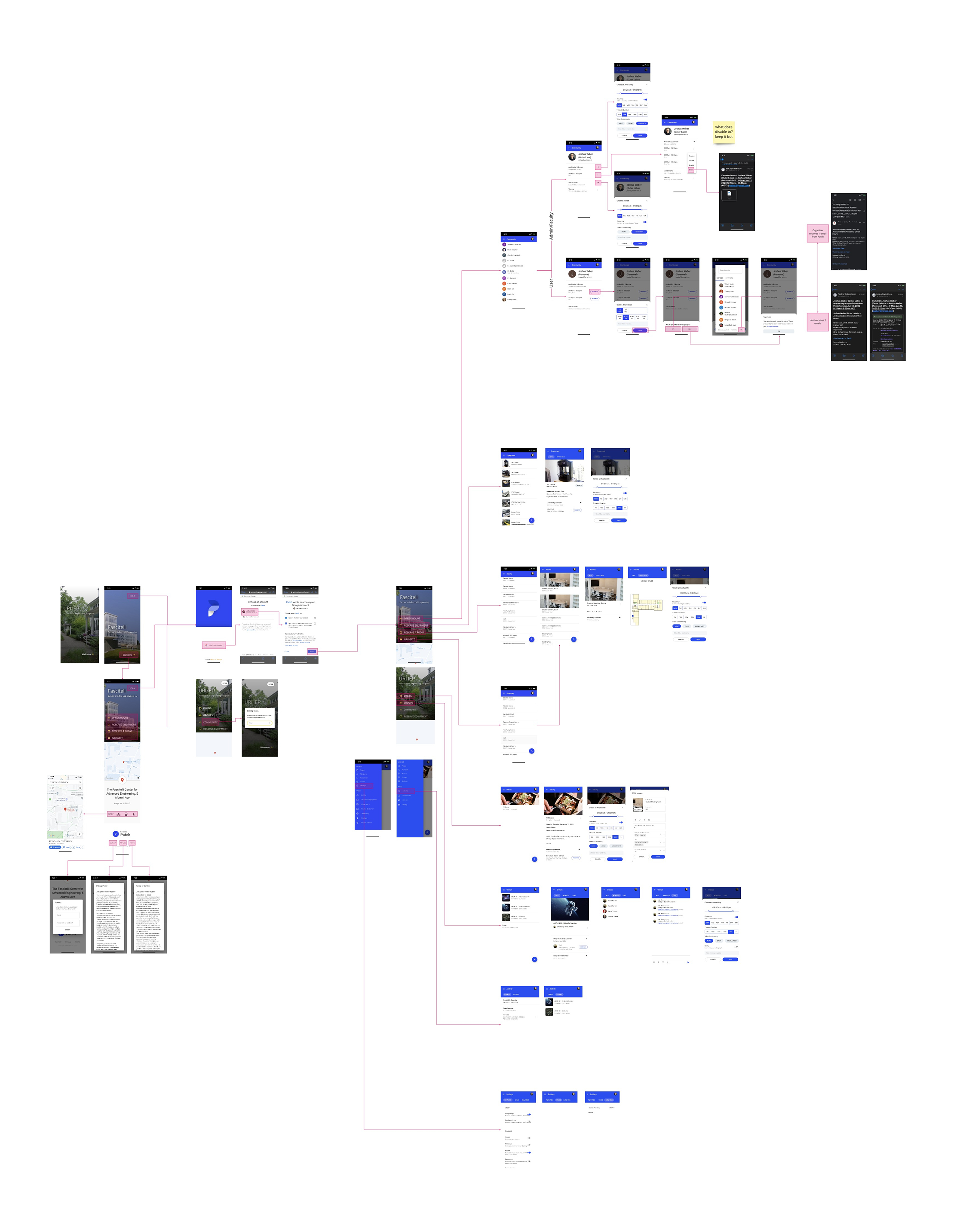
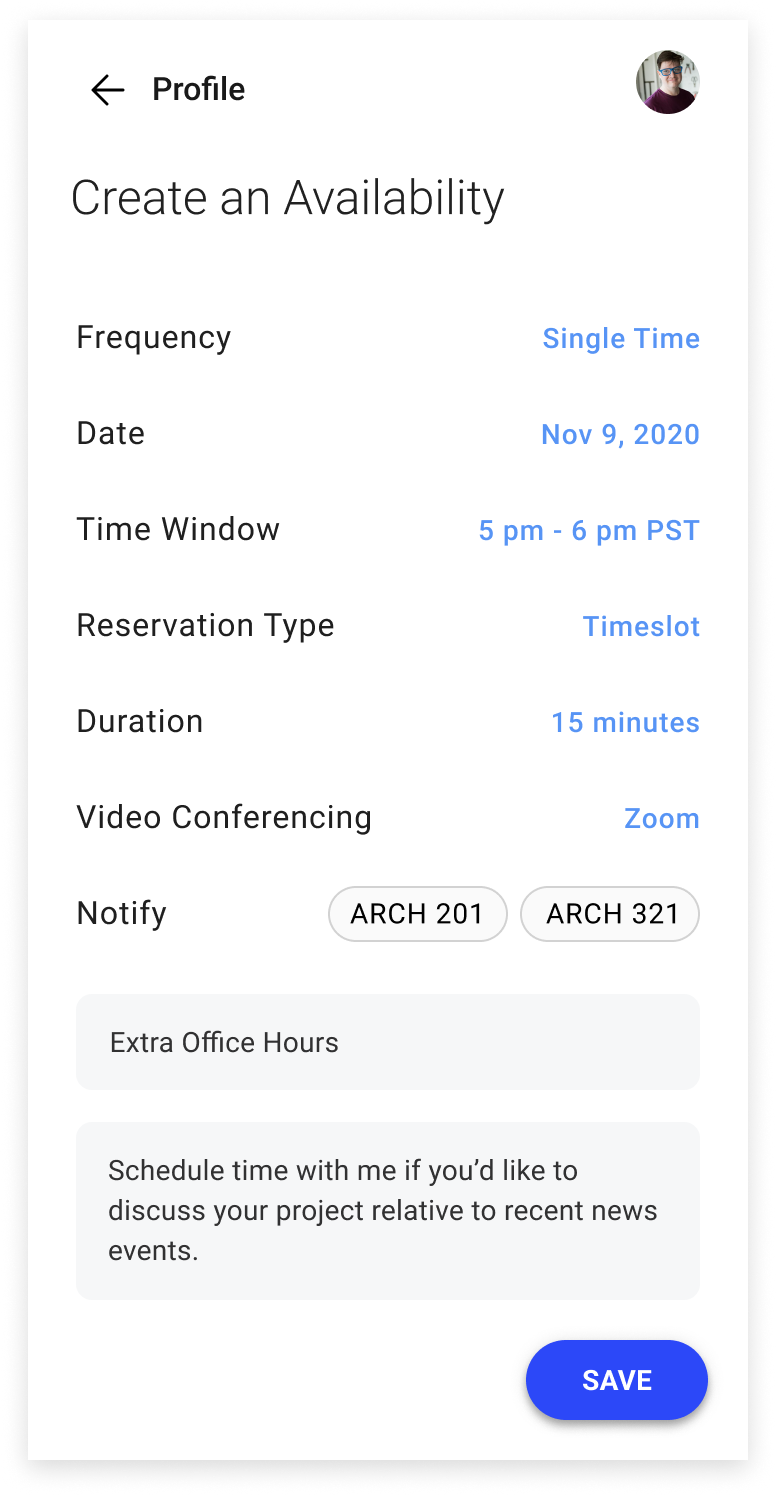
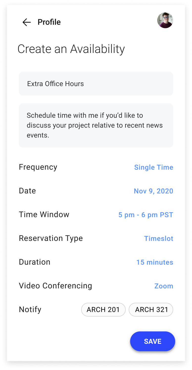
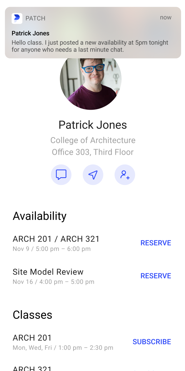
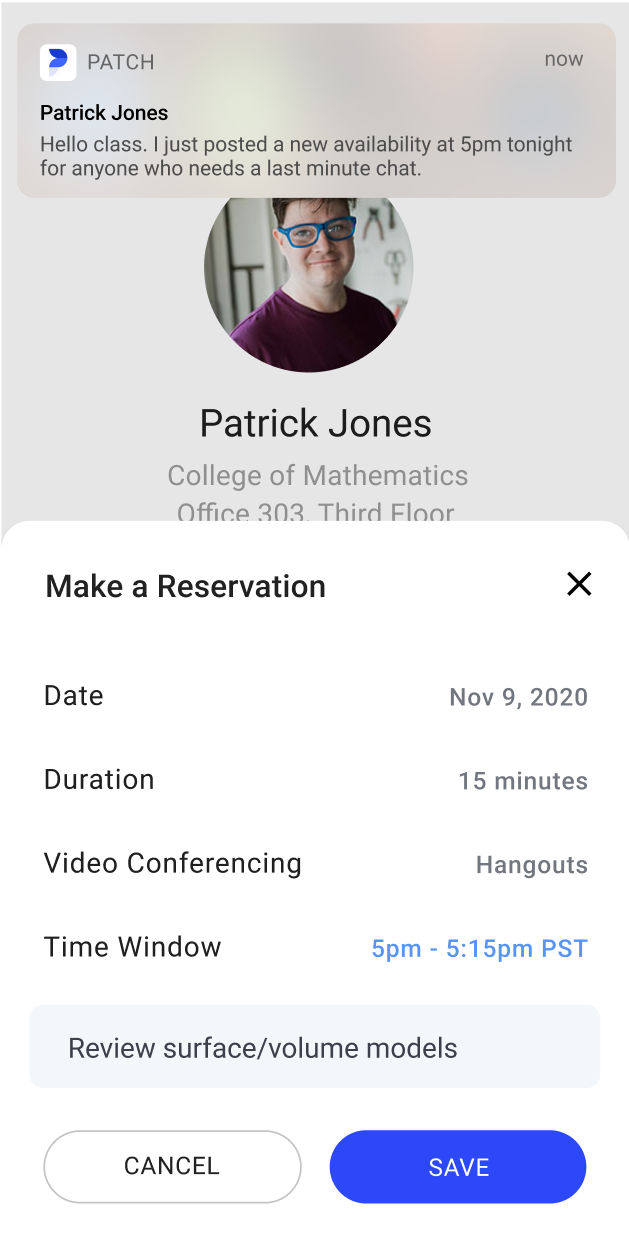
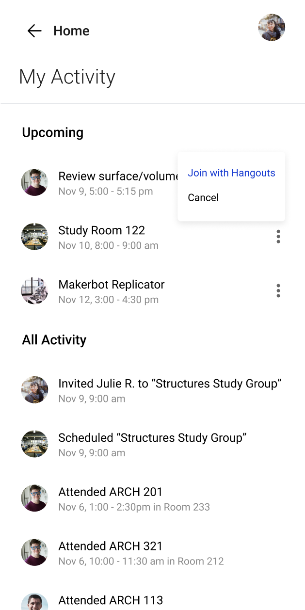
Thanks to the groundwork we had already done, we were able to move into Figma and begin updating Patch’s UI and UX with confidence and clarity.

Groups

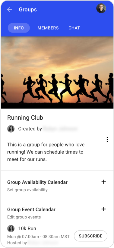
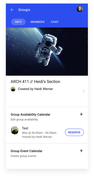
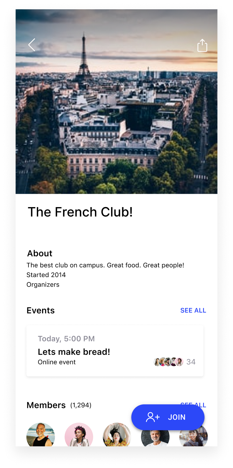
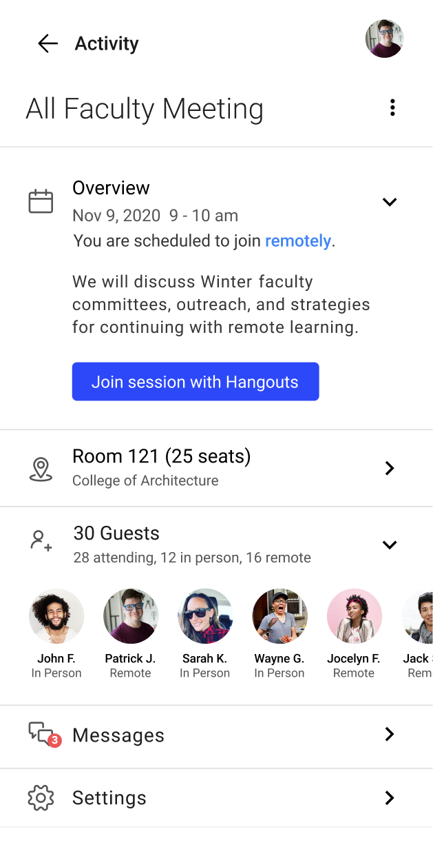
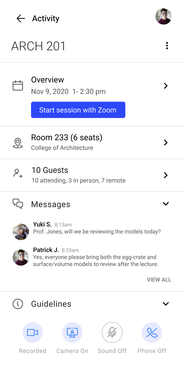
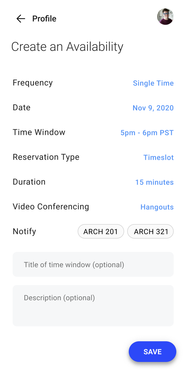
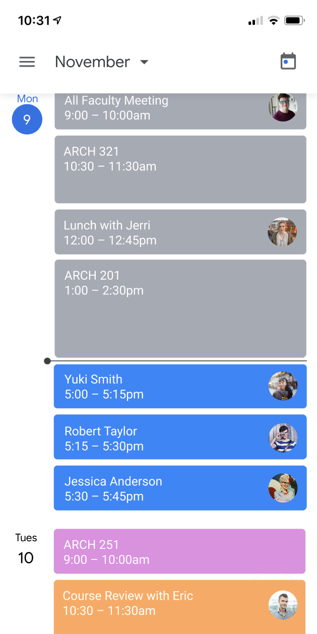
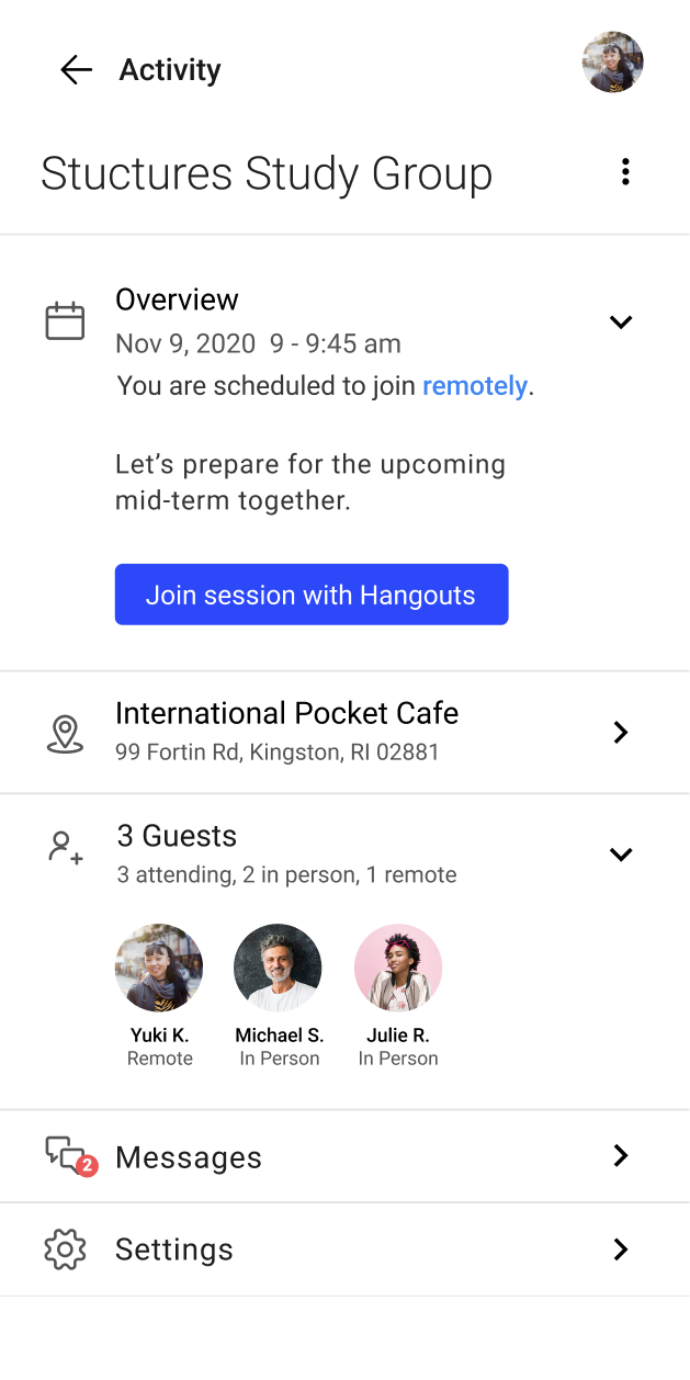
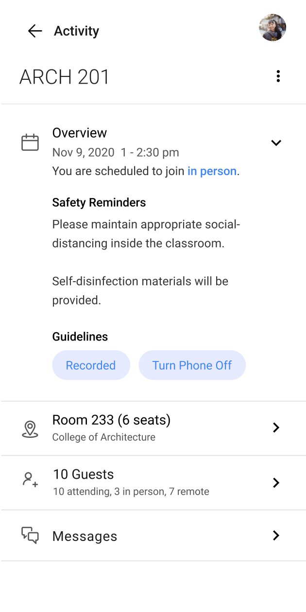
Groups was no longer one section since COVID was growing and affecting more parts of higher education like clubs and other group activities...students needed more options!

Group detail page

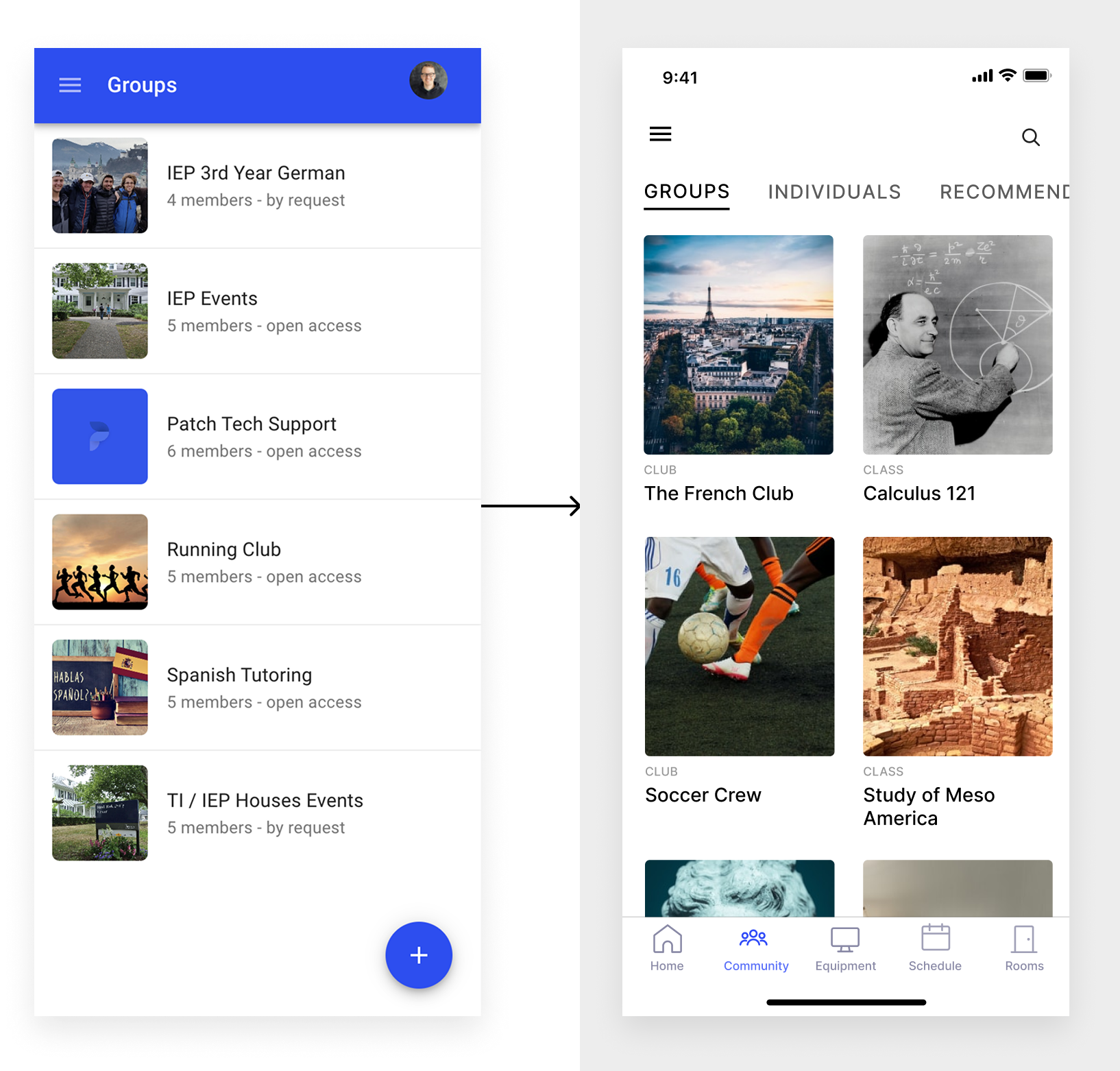
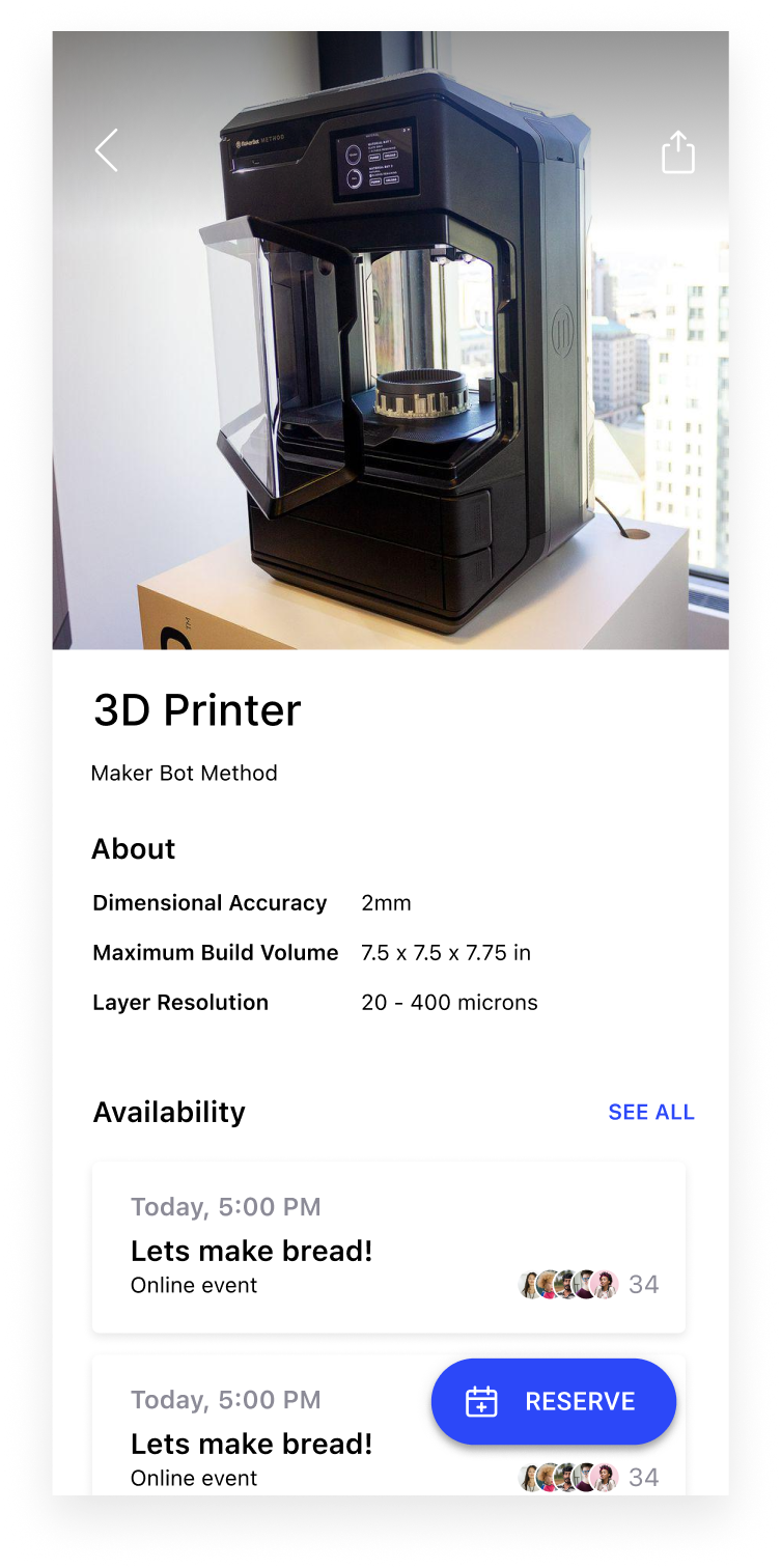
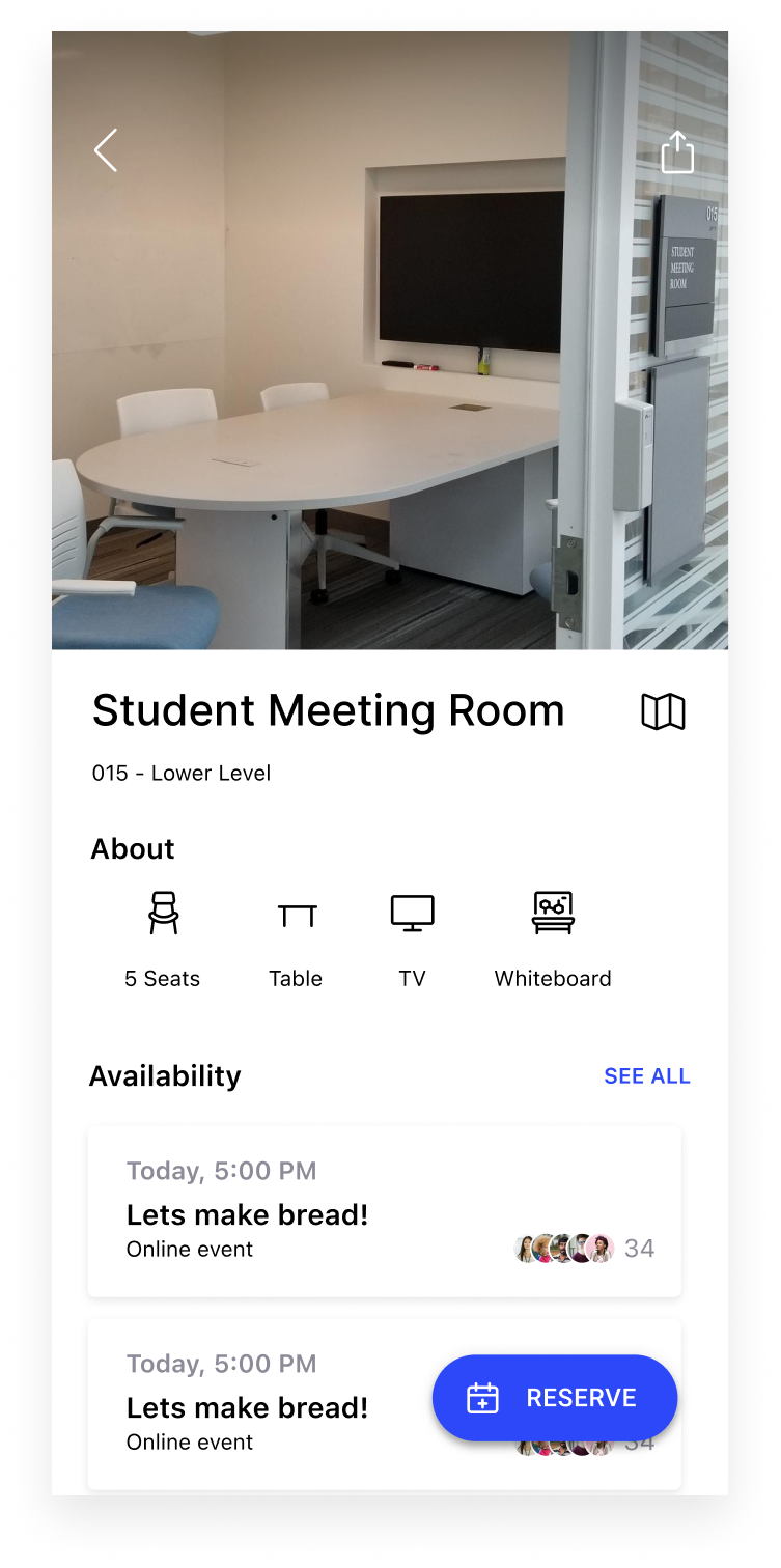
We placed greater emphasis on the group by moving secondary items further down the page. This made it easier for users to discover team members and current events available for checkout.

Improved visual hierarchy and thoughtful use of typography enhanced overall discoverability—something users were genuinely excited about.

creating events

In a remote learning environment, creating events became more crucial than we initially expected. Students and professors relied on this feature to keep activities organized and flowing smoothly. I designed the interface to resemble an itinerary, making it easy to scan from top to bottom.

day in the life

I created multiple items—such as breaking down a full day for both professors and students—helped me understand when and how people would use the app.

Collaborating with them to better understand these touch points provided valuable insights into gaps and areas that needed improvement.

Faculty

9am
1pm
4pm
5pm

Student

9am
1pm
4pm
-
5pm

Additional pages

We added lots of new screens like...wait for it...an actual homepage! Bottom navigation for quick access to all parts of the app.

Building map with heat zones to allow to social distancing. Professor pages for students to learn and better connect while learning remotely.

Next case study

@2025 Joshua Weber